CNN’s Democratic Presidential Debate – a Lesson in Web Design
When was the last time you picked up a paper? News today comes from many sources. Unlike pre-internet decades, the internet is unquestionably a major source of news for people these days. Internet news sites like Vice News have taken the lead and left traditional news models in the dust. Looking at news sites is often a great way to get clues and hints of what these high traffic sites are learning from their analytics and user metrics.
The circus that is pre-election politics begins no less than one year before a general election. Major network news agencies like Fox News and CNN have been hosting record breaking televised debates. These major news agencies likely spend a lot of money on their website and online marketing. Millions tune into their televised debates and their website, they know that they have to keep the messaging on their website and TV programming in conjunction with one another.
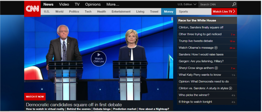
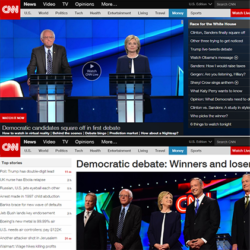
On October 13th, 2015, CNN aired the first Democratic Presidential Debate. As a web interaction designer, I tend to view websites a certain way. Looking at the CNN homepage that night, I noticed a major change in the layout of the CNN homepage during the debate. The changes in layout reflect what information CNN is trying to bring to the viewer’s attention first.
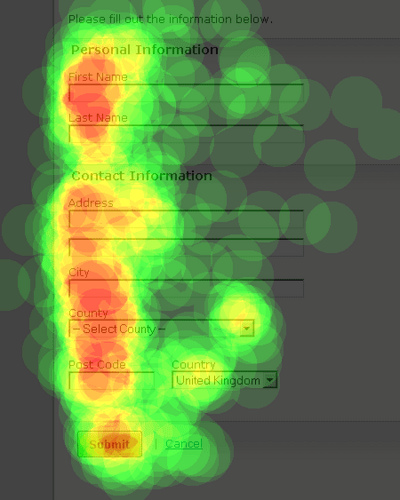
Studies show that “Web users spend 69% of their time viewing the left half of the page and 30% viewing the right half. A conventional layout is thus more likely to make sites profitable.”
 CNN has used this principal during important programming like presidential debates to feature it using the large jumbotron image.

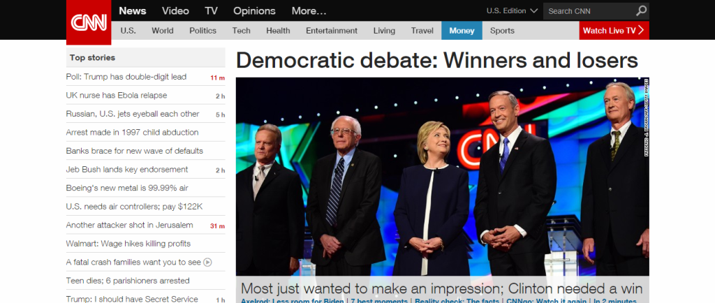
Notice the main image on the homepage to the left of the screen. This is where the user’s eyes go first. The user sees the main image featuring CNN’s primetime debate. The news list that normally occupies the left side, goes to the right side of the screen as it is not as important during the debate. The background image changes to a striking dark color to bring additional contrast and emphasis to the programming.
After the debate, the homepage returns to it’s normal layout with the news list occupying the highest converting area of the webpage on the left.

